How to Make a Graph Using Microsoft Excel
How to Make Charts or Graphs in Excel?
Steps in Making Graphs in Excel
- Numerical Data: The very first thing required in your excel is numerical data. Charts or graphs can only be built using numerical data sets.
- Data Headings: This is often called as the data labels. The headings of each column should be understandable & readable.
- Data in Proper Order: it is very important how your data looks in excel. If the information to build a chart is bits & pieces, then you might find it very difficult to build a chart. So arrange the data in a proper manner.
Examples (Step by Step)
Below are some examples of how to make charts in excel.
You can download this Make Chart Excel Template here – Make Chart Excel Template
Example #1
Assume you have passed six years of sales data, and you want to show them in visuals or graphs.

- Select the date range you are using for a graph.

- Go to INSERT tab > under the Chart section, select the COLUMN chart. Under the Column chart, you can see many other types but select the first one.

- As soon as you have selected the chart, you will see this chart in your excel.
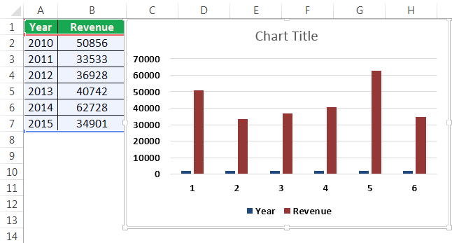
- This is not the finished product yet. We need to make some arrangements here. Select the blue colored bars and hit the delete button or right click on bars and select delete.

- Now, we don't know which bar representing which year. So right-click on the chart & select, Select Data.

- In the below window, click on EDIT, which is there on the right-hand side.

- After you click on the EDIT option, you will see below a small dialogue box; this will ask you to select the Horizontal Axis labels. So select the Year column.

- Now, we have the year name below each bar.

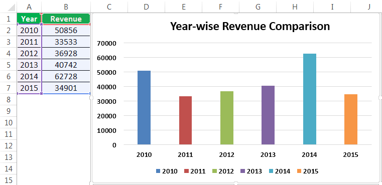
- Change the heading or title of the chart as per your requirement by double-clicking on the existing title.

- Add Data Labels for each bar. Data labels are nothing but each bar's numbers to convey the message perfectly. Right-click on the column bars and select Data Labels.

- Change the color of the column bars to different colors. Select the bars and press Ctrl + 1. You will see the format chart dialogue box on the right-hand side.

- Go to the FILL option; select the option Vary colors by Point.

Now we have a neatly arranged chart in front of us.
Example #2
We have seen how to create a graph with auto-selection of the data range. Now I will show you how to build an excel chart with manual selection of the data.
- Step 1: Place the cursor in the empty cell and click on the insert chart.

- Step 2: After you click on Insert Chart, you will see an empty chart.

- Step 3: Now right-click on the chart and choose the Select Data option.

- Step 4: In the below window, click on Add.

- Step 5: In the below window under Series Name, select the heading of the data series, and under Series Values, select data series values.

- Step 6: Now, the default chart is ready.

Now apply the steps I have shown in the previous example to modify the chart. Refer to steps from 5 to 12 to modify the chart.
Things to Remember
- For the same data, we can insert all types of charts; it is important to identify a suitable chart.
- If the data is smaller, it is easy to plot a graph without any hurdles.
- In the case of percentage, data select the PIE chart The pie chart is a circular excel chart representing the visualization of data in a circular format. In this circular chart, every category of data has its part, and all the categories make it as a whole circular data. read more .
- Try using different charts for the same data to identify the best fit chart for the data set.
Recommended Articles
This has been a guide to Make Chart in Excel. Here we discuss how to Make Charts or Graphs in Excel along with practical examples and a downloadable excel template. You may learn more about excel from the following articles –
- Organization Chart in Excel
- Examples of Line Chart in Excel
- Excel Chart Templates
- 8 Types of Charts in Excel
- Infographics in Excel
- 35+ Courses
- 120+ Hours
- Full Lifetime Access
- Certificate of Completion
LEARN MORE >>
Reader Interactions
How to Make a Graph Using Microsoft Excel
Source: https://www.wallstreetmojo.com/how-to-make-graph-chart-in-excel/